Making a cover for Sand and Blood
I love making things. There is something about being able to point to something (electronically or literally) and be able to say "I did this." I get it every time I run a program I write, read one of my old stories, or point to a bookshelf that I made years ago. Yes, I constantly see the flaws in it, but most other people don't seem to notice, so I think I'm getting better at it.
When I decided to make the cover for Sand and Blood, it was a chance to have fun and create a cover for the book. I know that my preferred type of cover won't work at this point, but there are actually multiple parts to creating a cover. My inability to draw and paint a cover is just one fraction of the greater whole.
I also like helping others and getting help myself. At work, I mentor others in programming techniques and design, but I also learn constantly from others. But, I don't work well with classes and the such. Instead, I prefer tutorials and the power of Google to learn. Give me ideas or suggestions.
This is a writeup of how I made the cover. It's in a partial tutorial form, mainly with some screen shots to show what I've done. It won't be step-by-step, though, so it isn't what I call a proper tutorials.
Programs
The starting point is the programs. While I'm capable at Photoshop and Illustrator, along with probably a dozen other graphics programs, I decided to stick with a limited number of programs and get really good at them. In my case, I use Gimp and Inkscape for a number of reasons:
- They are Open Source Software (OSS)
- They run on every platform I use (Windows, Linux)
- They both have great communities
- They don't cost me anything (I do donate to OSS projects though)
In general, I use Inkscape to create covers. Because it is a vector-based program, it handles scaling and resizing a lot better than Gimp does. It also avoids some of the artifacts with the text when I create a cover at full size (2,500 pixels or greater) and then scale down to a proper thumbnail (say 300 pixels).
Sizes and Arrangement
I'm working on both a print and ebook version of Sand and Blood, so I have to take both into consideration while creating covers. For print books, the most common format in the US is the trade paperback size. This is the taller of the two basic sizes and the most common you'll see from self-publishers.
I'm somewhat of a geek and love the ISO paper standard (the math behind it is sexy). I know (being based in the US) that ISO paper sizes are rare, but that still doesn't mean I can't like them. The Print on Demand (POD) printer I'm planning on using does have ISO paper sizes and A5 is very close to the trade paperback format. Naturally, I'm going to pick that for the size of the printed book. It also means that the cover is going to use the A5 ratio (though I suspect almost no one will notice unless it's pointed out).
| Size | Metric | Imperial | Ratio |
|---|---|---|---|
| Trade | 152.4 x 228.6 mm | 6.0 x 9.0 in | 0.666 |
| A5 | 148.0 x 210.0 mm | 5.8 x 8.3 in | 0.705 |
The other component to printed books is the size of the spine. There are a couple ways of handling it, but since I'm aiming toward a wrap-around cover, I need to take that into account when I figure out the actual size of the cover.
Sand and Blood is about 68,808 words before I get it back from the editor. Using an average of 250 words per page, this means the book will be about 276 pages. Using a random spine calculator, it comes out to 13.7 mm (0.539 in). I use a rough estimate because the typesetting isn't quite done at this point (I haven't gotten through the editor), so I'm going to pad the sizes as I go.
Taking everything in above, the front cover is going to be 148 x 210 mm and the entire cover, including spine, would be 311 x 210 mm (actually, the math says 309.7 mm, but I'm bumping it up just in case).
Ratios
The last major component to the covers I'm making is where I'm putting the title and byline. This is optional for most people, but I really like it when the titles all line up. After hundreds of hours of sorting books (as penalty chores), it's the little things that really appeal to me. So, when working on Casting Call, I came with a ratio on the cover to place everything. Naturally, given my geekish nature, it is based on the Golden Mean (1.618).
The text on the cover verses pure image is with a 1:1.618 ratio. Of the "1", it is split 1:1.618 with the title being the larger section and the byline being the smallest part. If we shuffle this around a little bit, we get these expressions:
- bylineHeight: 1
- titleHeight: 1.618 * bylineHeight
- totalTextHeight: (1 + 1.618) * bylineHeight
- totalHeight: (1 + 1.618) * totalTextHeight
Expanding this out, I'll get the following heights:
- textHeight: totalHeight / 2.618
- titleHeight: 1.618 * textHeight / 2.618
- bylineHeight: textHeight / 2.618
- graphicsHeight = totalHeight - titleHeight - bylineHeight
- textHeight (again): 1.618 * (totalHeight / 2.618) / 2.618
- bylineHeight (again): (totalHeight / 2.618) / 2.618
Putting in the height of 210 mm, I get this:
- titleHeight = 49.57 mm
- bylineHeight = 30.64 mm
- graphicsHeight = 129.79 mm
Blocking everything off
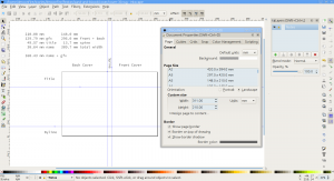 Now that I have all of our sizes and ratios, I can start actually making the cover. I start with creating an Inkscape document with the proper size. I also create a number of guidelines to block out the regions of the page.
After a lot of years of being unable to do math properly, I set up the first layer to have some notes on the sizes I'm using. Just in case I need to know what numbers I was using then.
This is a wrap-around cover, so the right side will be the front cover and the left will be the back. The middle section is the spine. I add labels to the various sections, just to make it easier since I frequently get interrupted at home while doing stuff like this.
To make things a little easier, I create a couple extra layers.
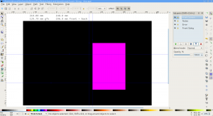 The first is the create various screens and masks. This makes it easier to focus on "just" the front cover verses paying attention to the cover as a whole. We do this by creating a "screen" which hides everything but the front cover. This will be called "Front Screen" and it won't have any contents.
I'm also going to create an error layer. This just has a bright purple background and will tell us if we have some area on the cover we haven't covered yet.
The third layer (Front Sizing) is to make it easier to export the front cover from inside Inkscape. When I export the front, we just activate that layer, select all (Control A), and then export the bitmap.
- Create the Front Screen layer on top of the notes layer.
- Create the Error layer below the notes
- Create the Front Sizing layer below everything
- Activate the Front Sizing layer
- Create a new box somewhere and use the toolbar to set the X, Y, Width, and Height manually. Once you enter the values, it should be a plain box where the cover would be.
- X: 161.7 mm (148 mm plus the spine of 13.7 mm)
- Y: 0 mm
- Width: 148.0 mm
- Height: 210.0 mm
- Duplicate the box (select it and Control-D)
- Move the duplicate to the Front Screen layer (Control-PageUp a few times)
- Activate the Front Screen layer
- Create a huge box that covers everything on the document
- Move the huge box down to the bottom (from the menu if you want)
- Select the huge box and the duplicated box you put in the Front Screen layer
- Subtract the one box from the other (Control-Minus or Path / Difference). This should create a large box with a hole in it that only shows the cover.
- Make the huge box with a hole's color to white, this will match the bulk of the websites your cover will be shown.
- Lock and hide the Front Screen. Whenever you want to see the cover only, just unhide the front screen.
- Activate the Error layer
- Draw a random box and use the settings to control its dimensions:
- X: 0 mm
- Y: 0 mm
- Width: 311 mm (or whatever the width of your document)
- Height: 210 mm
- Change the fill to bright purple
- Lock the Error layer
At this point, I just have a great big purple rectangle on the screen. This is useful when we're working so we can tell where our cover doesn't quite line up on the edges or if we're missing something.
The Front Sizing layer won't be visible at all. You'll notice that I didn't say hide or lock it. Inkscape won't let you select if the layer is hidden or locked and we need to be able to select to do an easy export of the front cover.
Text
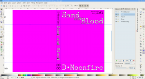 Once I have everything blocked out, I start with the text layer. Mostly, I just put the text where I think its going to go but with the intent of moving it around until everything looks right. Because of that, I make each word of the title (Sand and Blood) separate text objects. Also keep in mind that printing has a bit of variance, so its best not to put anything right against the edge of anything (say about 4-5 mm from any edge) since the printing may cut it off.
I do this on a dedicated Text layer which will be on top of everything but the screen.
When creating the text, I found it is important that you use a good stroke with the fill. If you look at other covers, you'll notice that very few of them use a solid fill on the text without a stroke. If you do, it makes it harder to read the text with a background behind it.
In this case, I'm using Underwood Champion because it has a nice rough edges and handles the glyphs I need. The font has a 0.4 mm stroke on it just to keep the text isolated. Over time, this changed through various fonts as I iteratively moved and shuffled things around. In the later images, the font is Impact with a 0.3 mm stroke.
Note: The black filled bowls for the spine are an artifact of Inkscape at the zoom that I use for screenshots. The final image won't have those.
It is important to note that this text is not the final. It is just to make sure all the elements are on the screen in the right size and proportions while figuring out the images. Don't get too hung up on the font choice or placement.
The background image
This is the fun (and frustrating) part. We're going to put in the image. With a properly designed background image, you'll find that this will be very easy. The more your image doesn't fit with the cover, the more you'll have to shift and move things around. In general, its a matter of finding the best combination of a good looking and the least amount of error space.
I do the rough sizing and arrangement in Inkscape, mainly because it is easy to move things around and see them in context with the text. There are others who are good enough to do that in Gimp, but I'm not. So, this step is to figure out where we want to scale and where to crop.
This is also the point where I have to be careful not to scale up the image too far. The print cover is at 300 dpi. This is very important because an image that looks good on the screen (72-90 dpi) will look fuzzy in print.
My source image is 2,800 x 4,200 pixels. This gives me a fair amount of flexibility if I have to scale or shift things around. While I can scale it to the point its less than 300 dpi, the further I get below that point, the worse the image will look like.
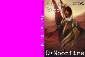 The first attempt at the image is one that just fills the front page with the image I got. This image would great if I was only doing an ebook. It is the image as Mr. Howard intended and it fits well.
The drawback is the printed version. When you look at it including the back cover, there is a lot of purple space that I have to fill in with something. I could go with the simple approach of making everything black, but I always felt it looked less than professional. There are very few books that have photographic or illustrated covers with solid color backs.
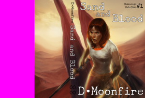 This second version is the natural scale of the image at 300 dpi. As you can tell, the image goes along the spine and a decent amount into the back of the cover. Since this is 300 dpi, I don't want to make it much larger otherwise the print version will suffer.
The actual answer is somewhere in between. That is more of an art form to find the right balance of color, content, and composition. You'll see later, I made the girl more central so the peak of her head lines up with the small "and".
Overall, this is probably the best I'll be able to get without ruining the image. The hard part is figuring out what to do with that last part of the back cover. Fortunately, back covers are usually covered in a blurb and other elements, so we'll be able to cheat a bit there.
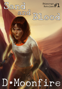 One thing to consider while working with wrap-around covers is to occasionally look at the front cover too. This is important because that is the image we'll see in the ebook store, but also what people will see on a shelf (in the chance you get your book face forward).
As I mentioned before, this is really easy to make this view. Make the "Cover Sizing" layer active and select all. Inkscape's Export dialog will automatically change it from "Page" to "Selection", but when it exports, it will use the visible part of the image. So, instead of getting a solid color box (which is what is selected), I get the complete front cover.
In this case, I think the composition of the front cover is pretty balanced here. Chimípu, the woman on the cover, is somewhat left of the front cover (like most fantasy books these days). From last post, I made more of her visible from feedback I got.
The title and the byline help balance out the image. I added the series title and volume in the upper right to help with the balance. I also made it black (though it will lighten up later), so draw less attention to it instead of the title. We want the reader to see the woman first, title second, and then the byline so that will pretty much tell us how to arrange the front cover.
Note: When I commissioned this piece, I should have insisted on a lot more on the left side of the image. But, for an artist who is used to doing portraits, it kind of goes against their sense of composition and balance. So, it "feels wrong" to have so much dead space.
Getting rid of that purple
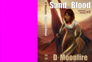 So, we still are working on getting rid of the purple (and I've tweaked it a few more times over my lunch break). There are a few ways of doing this. Each one has its own drawbacks:
- Scale the image larger and just span it. This works up to the point I start dipping below the 300 dpi layer. And, since the main character is in the center, her face moves over to the spine and we're just looking at part of her face (and none of the nifty fighting spike).
- Scale the left side of the image out to fit the rest. This is actually what I planned on doing originally, but it skewed the image so badly that it looked horrible. Plus, it changed the nice curve of the background into a flat section with a sharp line where it changed. It wasn't pretty and I won't make screenshots of that.
- Cover it up.
Actually, covering it up is my plan at the moment. This benefits me in a couple ways. One, it is very hard to read text on a noisy background. While there are readers out there that have sharp eyes and the ability to tell the difference between #223344FF and #223544FF, I can't. If you look the back of most books, you might notice they either have a flat shaded gradient over the image or an opaque image that gives a "flat" area to put the blurb.
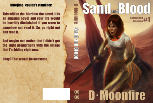 I decided to start with a slightly burnt paper background. It seemed like an easier way and didn't quite look as plain as a straight gradient. The paper came from iStockPhoto (I had some credits) and I basically trimmed off the white space using Gimp so it had a transparent edge. From there, I inserted it into Inkscape using File / Import... and arranged it to take.
In the above image, I created a placeholder blurb and also a white space for the UPC code. This way, I know where everything lines up as I fill in the gaps.
Iterative development
If you can't tell from the progression of images, things change constantly. Like writing, the editing process will result in a different font, layout. The background image will shift around until I'm happy.
The important part is to realize this isn't something that should be done in a single day. Sleep on it, play around. Let it sit for a few days and then come back. Creating a cover works just like writing and editing. It takes time and experience.
Mistakes
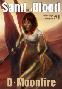 No cover is perfect and this one isn't either. And being the one who makes it, I'm probably going to be my worst critique. And I'm also rather opinionated of what I like in book covers.
There were a few things, moving forward, I can do better next time. The biggest is the cover. The commissioned image was actually an impulse purchase of mine, and it was given to someone who didn't have a lot of time before they ran off to a convention (actually, the commission was to pay for said trip). My original request was a bit too vague, but I also wasn't picky enough about what I needed during the process.
One of the reasons that I want to learn how to draw is to make my own covers because I'm passionate about these topics and I can redo it if I didn't get it right. But, my skill at drawing isn't sufficient for this and I'm not going to get a second commissioned image for this cover. Instead, I decided to work with what I got and I think I did a decent job of it.
The key part is learning what made my life difficult this time and make sure the next commissioned cover works better.
Metadata
Categories:
Tags: