New Site Colors
I should have been working on something else today, but a series of events lead me down a path of reworking how I implemented my themes here on https://d.moonfire.us/ and https://fedran.com/.
I have not updated the color themes on Fedran at this point.
In specific, it was someone mentioning they didn't like my dark theme on their recently announced blogroll. Now, there is absolutely nothing wrong with someone not liking my sense of colors or even how I code websites, but a desire to change the colors has been sitting in the back of my head for a few months. That meant that the commentary reminded me of my own desires to change it and that lead into my fixating on redoing the colors.
Color Preferences
One of the problems is that I have a fondness for mono- and bichromatic color themes. You can see that on my covers, but I also realize that it creates rather plain (e.g., uninteresting) site theme. I started to really notice it once I started using Catppuccin as one of my most common UI themes. There were colors on the screen! Multiple of theme!
And I started wanting a few distinct of my own.
At the same time, I continue to struggle with contrasts. When I was younger (teenager and 20s), I loved drawing on quadraile graph paper. But somewhere in my 30s, I started having trouble because the lines were making it hard for me to see my writing. So I went on a few adventures to find lighter lines and evetually switched to dotted grid pages. Then in my 40s, even those became too dark and I had to switch to the same thing my father used: plain white paper.
POV Colors
Related to this is my decision that every point of view in Fedran had a different color. I like that idea, mainly because I love colors, I'm just not great with seeing differences. This is why Sand and Blood has a different color set than Allegro.
Each POV has a color hue and everything else is built off of that using LCH colors. When I switched the covers to be bichromatic, I made the second color always be the contrast (rotate 180 degrees) from the primary color.
Easy huh?
However, this entire excercise pointed out that most people can't tell the difference between say 220 and 225 hue, so I really should spread out the colors a lot more. Even if I say a 6 degree difference in hues, that would limit me to sixty POVs. (Of course, since I'm still somewhat burned out, sixty is a lot right now.)
So, I'm going to change it so each POV color is three colors: the primary color I had before and then two accent colors (which the first will be the contrast color for the existing assigned colors). I'm not quite ready for the full gaumt of colors, but maybe increasing them to three would give me more than enough space and still cater to my reduced color palette.
It also harkens back to CGA colors, which is the first colors I saw on computers.
Segmenting Colors
The general idea was to break the color space into ten segments, numbers from zero to nine. The first color (c0) would be based on the hue and the others would be 36° from that so they are evenly spread across the entire range of hues.
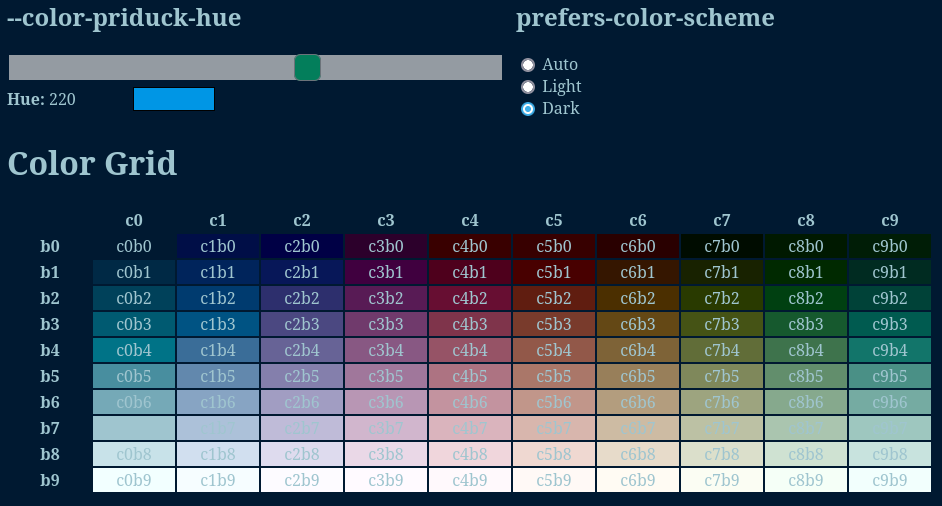
If the hue changes (like the POV hues), then everything else rotates to fit.
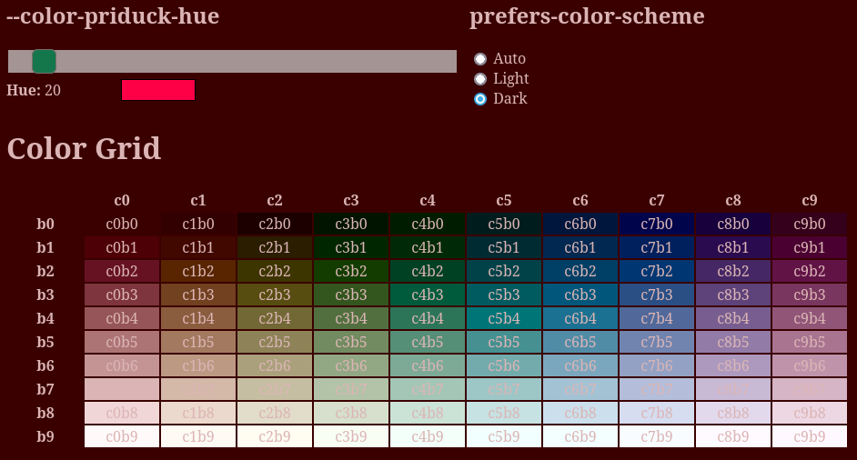
As you can see in the above images, there is also ten ranges of brightness (combination of saturation and lightness) that goes from zero to nine with zero being a not-quite-black version of the color and nine being a not-quite-white version.
This effectively gives me a wide range of colors that aren't very close to each other but still a small enough set I'm not struggling with the differences of 218° and 223°.
CSS
Because I've really embraced CSS variables instead of going directly to SASS or LESS, this entire thing uses various CSS variables such as --color-priduck-c0b0 and --color-priduck-c9b9. They use calc() and lch() to build the colors from the base hue of --color-priduck-hue.
Eventually, I hope to create some symbolic ones like --color-priduck-comment or something that would allow customizations.
This will also lead into the rgb() colors that I need to do the Fedran covers.
Libraries
I ended up writing two little NPM packages to support these and let me try it out. These are not even remotely documented because… I would consider them alpha until I get Fedran integrated with them. By then, I should have something I feel is “right” but also expand it out into the other components I need such as the color-rotation code to make the covers and other stuff.
Needless to say, if I like this, it will take me about six months to a year to finish integrating it into my system. Which means I want to make sure this is the direction I want to go.
I also decided to call this the Priduck Color Theme, because “priduck” sounded funny, doesn't have a lot of search hits, and it reminds me a lot of the Useless Duck Company, a set of hilarious shorts about inventing.
@priduck-color-theme/base for Node
https://src.mfgames.com/priduck-color-theme/priduck-color-theme-base-js
Naturally, trying to build all of these was a little tedious so I wrote an ad-hoc programs to generate the color schemes using CSS variables. Then put it into a NPM package because I don't like copy/pasting things when I know I'm going to be tweaking it over time (including adding symbolic colors so I can have a default colors for language keywords, surfaces, and accents).
This lets me just include it into the CSS files as needed.
@import "~@priduck-color-theme/base/colors.css";

:root {
    --color-priduck-hue: 220;
}
@priduck-color-theme/theme for Node
https://src.mfgames.com/priduck-color-theme/priduck-color-theme-theme-js
I also wrote another because there isn't a good way to write a DRY version of CSS themes that can handle default values, the browser providing prefers-color-scheme and prefers-contrast, and setting them via attributes in various combinations. So I wanted to be able to provide six files (dark/light and more/less contrast for both of those).
Metadata
Categories:
Tags: