Sand and Blood cover

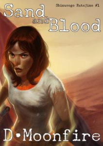
This weekend, I did a little work on creating a cover for Sand and Blood. It was taking an image that I got from the rather talented Dan Howard some months ago and was just sitting on it. Originally, this was my contingency cover, but after some other things happened, I decided to focus on other things and this became my primary cover.
Chimípu
One of the major topics in the novel is the women on the cover, Chimípu, but she isn't the main character. The main character, Rutejìmo, didn't quite work out as a cover and I think that she would be a better "draw" for the story. More importantly, I can show that Chimípu has magical powers a lot easier than I could Rutejìmo.
One of my major requests is that Dan did not create a cover that Jim C. Hines would have made a parody of. I'm not fond of the butt-and-boob covers anyways and I really wanted someone scuffed, dirty, and "not white". That last bit was probably the hardest since I wanted someone with Indian coloration. The image has that, but I hope that it doesn't come off as a white girl on the cover. Of course, I see colors that most people don't see, so I'm actually not sure if Dan pulled it off.
Wrapping Covers

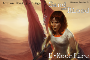
When dealing with printed books, which I plan on doing with SAB, I have to consider the spine and back cover. Unfortunately, I couldn't get a wrap-around cover from Dan, so I ended up scaling the image up (thankfully he gave me a 600 dpi version) and doing a bit of trickery to make it look good.
Actually, I did a bit more than that. To keep from scaling too much, I actually took the left most of the wrapped cover and scaled that out a bit. And then scaled out a little bit more of it. That way, the important part of the images are pretty much within the 300 dpi range, but the left-most will be fuzzy because it is scaled down to 150 dpi. Though, given that it is mostly one color and be obscured by the back title blurb, I figured it would be okay.
I need to find better directions on how to composite images though when I commission the next one.
Numbering
On the spine, you might notice that I put in a "01 01" in there. This comes from when I was growing up. Since I got in trouble a lot and my mother had a lot of books, I was frequently tasked with alphabetizing the entire house library. One of the more annoying things was trying to get author's books in the right order since frequently their titles didn't match the order of the series. The first "01" is just the first series I'm writing (I plan on their being more) and the second is the number in the series. So, SAL will be "01 02" and FOTS will be "02 01".
I may switch that to "00 00" because I'm strange.
Font
For font, I wanted to go with something rough but still relatively readable. I started with Underwood Champion, just because it is a fairly solid font and it handled the accented character I needed for the series name. I'll use a complimentary font for the back title blurb though since I think Underwood doesn't scale entirely that well for smaller text (and it's monospaced which looks weird).
Original

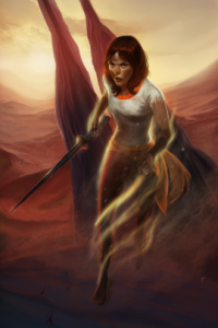
The original image would be a perfect cover on its own. I'm just not entirely sure how to make the spine and back look good. I could duplicate the front for the back, but I've always disliked that in books so it would be hypocritical of doing it myself.
Opinions
As always, opinions are greatly appreciated. I plan on tweaking and adjusting it over the next few months, but overall, I think it is a good, solid cover for the novel.
Metadata
Categories:
Tags: