Miwāfu Glyphs Redux - Scanning
I don't write out things by hand very often. The little imperfections always annoy me, which is why I'd rather create a font that write it out. That way, I can also use the font on the Fedran website to show characters in their native language.
Series
This is going to be broken into multiple posts about the steps of making a font.
- 2014-08-17 Miwāfu Glyphs Redux - Redrawing - Since I picked up a few new calligraphy pens for my birthday, I tried to write out Miwāfu and found that it was a bit more difficult than I thought. So I redrew them until they weren't difficult.
- 2014-08-18 Miwāfu Glyphs Redux - Scanning - After drawing out the Miwāfu glyphs by hand, I had to scan them in and get them ready for us.
- 2014-08-19 Miwāfu Glyphs Redux - Vectors - Once I got a clean raster version of the glyphs, I use Inkscape to create a vector format which is suitable for importing into FontForge. Part 3 of creating a Miwāfu font.
- 2014-08-20 Miwāfu Glyphs Redux - Basic Font - Continuing my series of making a conscript, this describes the steps of going from a cleaned up vector version of the script to a basic font.
Scanning the file
The process of scanning in hand-drawn images is fairly simple one. I have a Canon all-in-one printers/scanner which writes out scanned images as PDF to a SD card. I threw everything into a single PDF and then broke it out into individual PNG files using an overly complicated process.
I should have just scanned each page individually, but it was late and I wanted to go to bed.
Removing blue lines
The first thing I did was open the scanned images into Gimp. I use single window mode (from the Windows menu) because it plays better with my monitor.
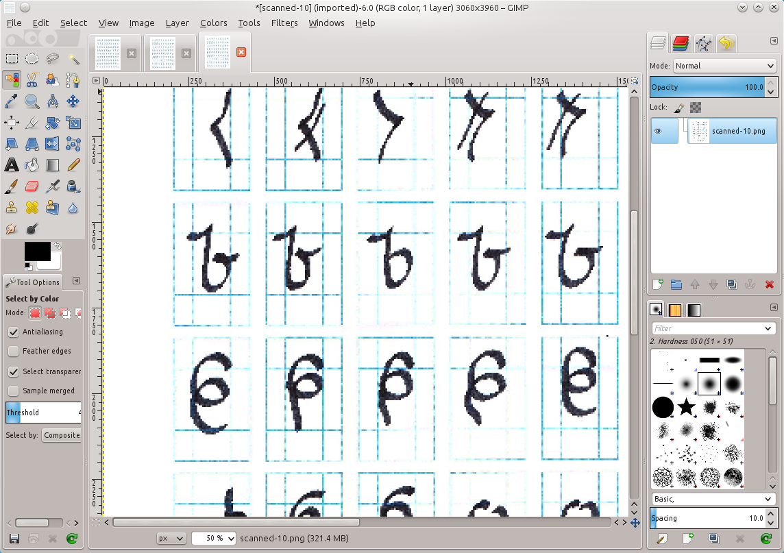
The next is to create a white layer and put it below everything. This will let me use Cut instead of fill to remove elements.
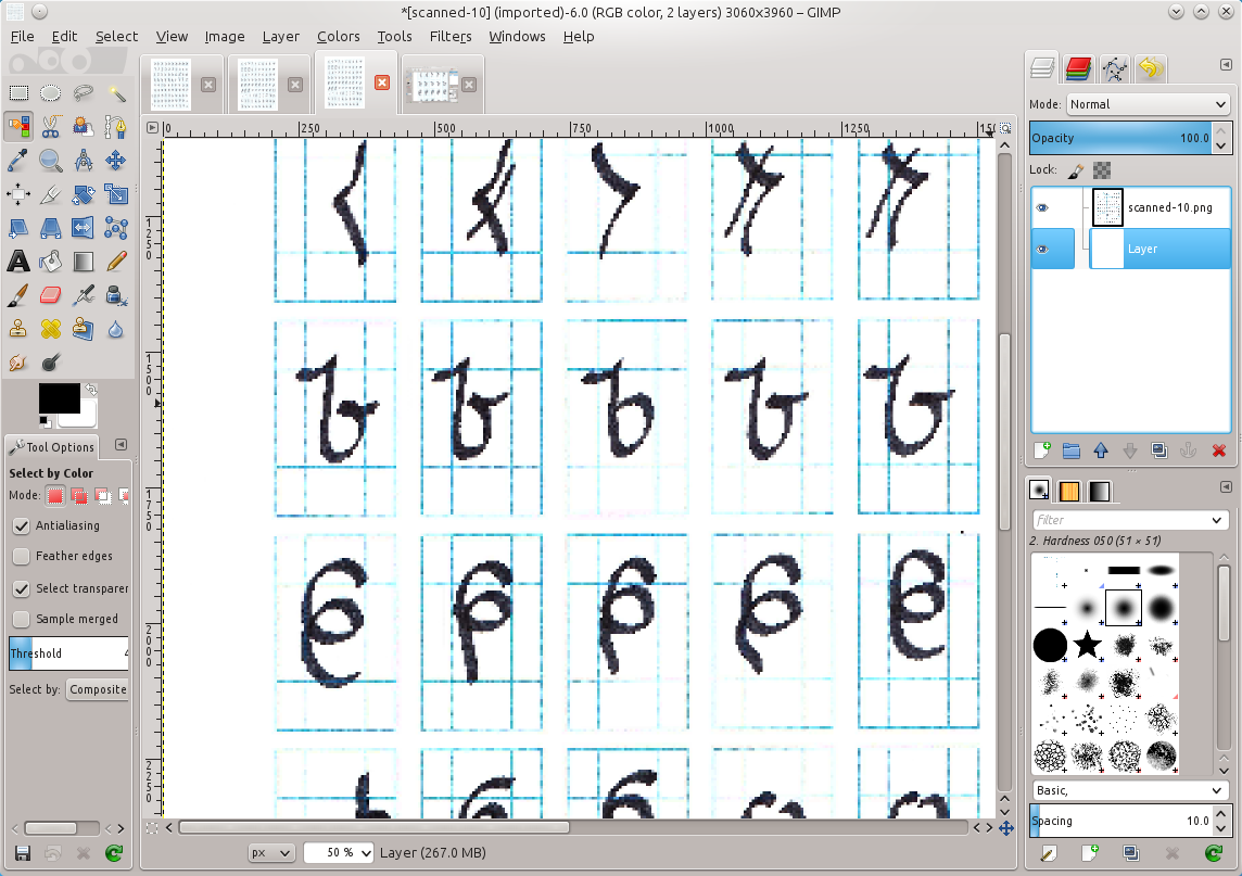
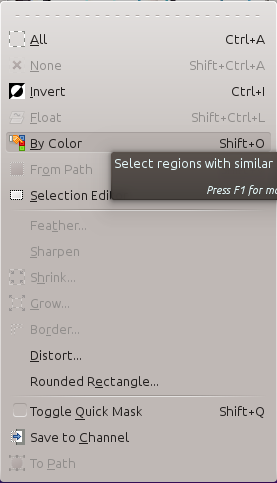
After selecting the main layer again, select by color (right-click, Select, By Color…) and set the threshold to 40.0.
With those settings, just click on the blue line and cut (Control-X). Because we put a white layer behind it, it will delete to white instead of transparent.

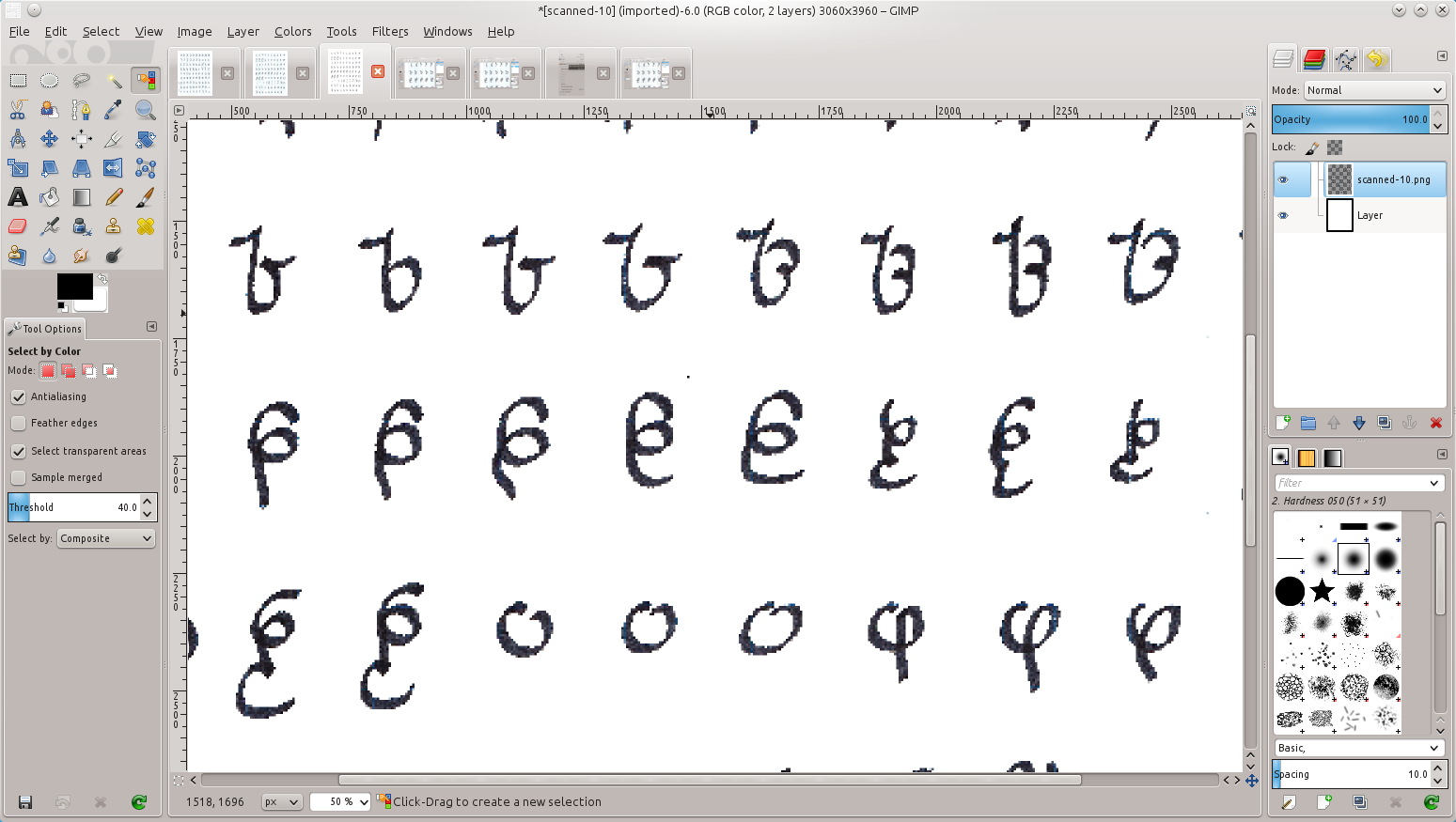
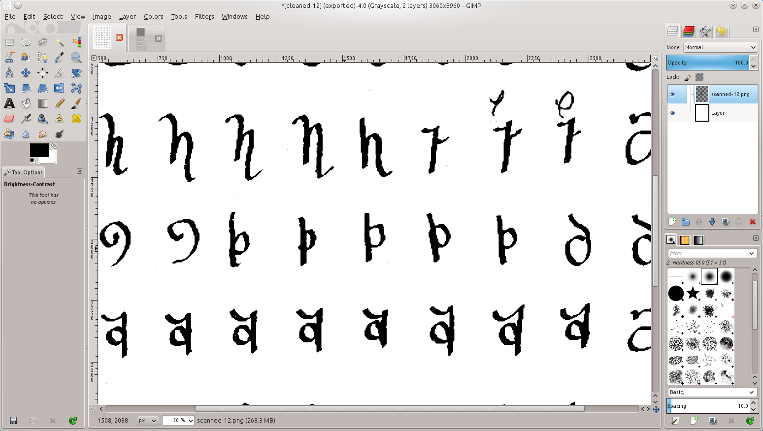
After doing this a few times, I get a white background image with the glyphs nice and stark on the page.
Sharpen the images
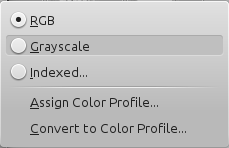
Once I have the guide lines removed, I made the text easier to trace. The first thing is to convert the image into grayscale and back to RGB. This removes any errant blue lines and darkens everything black.
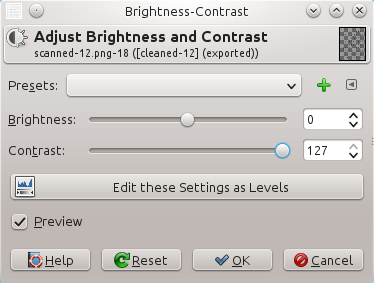
Once that is done, I jack up the contrast to deepen the black even more.
Smooth out the edges
The result is actually good enough for the next step for making a vector version. However, I ended up using the “Oilify” filter to smooth out the edges so the glyphs look reasonable even in Gimp. I like Oilify because it smooths out the rough edges of an image and gives a more newspaper printed appearance to the images.

The final result is a fairly dark glyph that is easily designed to be scanned.
Culling the herd
The final step was to go through all of the duplicated glyphs and find the best one of the lot. This was actually a couple hours of shifting images around, removing the ones that don't quite fit, and trying to decide the right shapes to use. Once that was done, I had a single image with one of each glyph.
In the future
The blue lines I used were a little too dark, which increased the complexity of removing the trace lines. I would use a lighter shade next time.
I also didn't need to use the oilify since I was scanning into the next step. The result is that the glyphs got a bit more blurred than needed, plus it distorted the shapes (which was magnified by other things I did later).
Metadata
Categories:
Tags: