Miwāfu Glyphs Redux - Basic Font
Fonts can be a scary beast. Like very other technical field, it has its own language and organization. Free programs for creating fonts are… let's call them difficult to use, but once you get into them, they are very powerful and capable (much like what I'm trying with Author Intrusion).
Series
This is going to be broken into multiple posts about the steps of making a font.
- 2014-08-17 Miwāfu Glyphs Redux - Redrawing - Since I picked up a few new calligraphy pens for my birthday, I tried to write out Miwāfu and found that it was a bit more difficult than I thought. So I redrew them until they weren't difficult.
- 2014-08-18 Miwāfu Glyphs Redux - Scanning - After drawing out the Miwāfu glyphs by hand, I had to scan them in and get them ready for us.
- 2014-08-19 Miwāfu Glyphs Redux - Vectors - Once I got a clean raster version of the glyphs, I use Inkscape to create a vector format which is suitable for importing into FontForge. Part 3 of creating a Miwāfu font.
- 2014-08-20 Miwāfu Glyphs Redux - Basic Font - Continuing my series of making a conscript, this describes the steps of going from a cleaned up vector version of the script to a basic font.
Unicode
While there are many different codes for fonts, these days Unicode is pretty much the one and only one to use. Unicode has more than enough code points and the organization to allow for conscripts (constructed scripts).
Unicode provides three areas for private use (creatively called Private Use Area or PUA). The first is E000-F8FF and has 6,400 points (somewhere you can place a glyph). The other two are at F0000-FFFFD and 100000-10FFFD and have 65k points each.
The PUA can be used by a lot of places: alternative characters, Easter eggs, swashes, non-standard ligatures, and conscripts.
ConScript Unicode Registry
The ConScript, or CSUR, is an attempt to organize the various use of conscripts in the private use areas. Basically, it's an informal “reservation” for a script to avoid someone else using those ranges.
Font creators don't have to use the the CSUR to figure out the fonts, but I consider it polite not to use one of the reserved ranges for my own private space. Of course, if the script gets popular, it will probably be moved around, but at least I'm not stepping on known toes.
Where to put everything
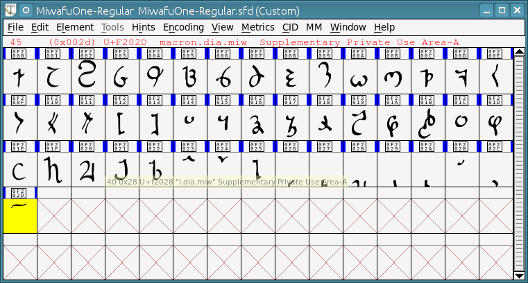
I'm starting my glyphs at F2000 which is currently not reserved. I need 46 glyphs at this point, though I would normally pad it to 64 characters to handle some of the custom characters that exist in the world (and to give me breathing room).
- F2000: MIWĀFU-W
- F2001: MIWĀFU-R
- F2002: MIWĀFU-M
- F2003: MIWĀFU-N
- F2004: MIWĀFU-H
- F2005: MIWĀFU-F
- F2006: MIWĀFU-P
- F2007: MIWĀFU-B
- F2008: MIWĀFU-S
- F2009: MIWĀFU-Z
- F200A: MIWĀFU-T
- F200B: MIWĀFU-D
- F200C: MIWĀFU-K
- F200D: MIWĀFU-G
- F200E: MIWĀFU-OPEN-QUOTE
- F200F: MIWĀFU-CLOSE-QUOTE
- F2010: MIWĀFU-OPEN-NESTED-QUOTE
- F2011: MIWĀFU-CLOSE-NESTED-QUOTE
- F2012: MIWĀFU-OPEN-NUMBER
- F2013: MIWĀFU-CLOSE-NUMBER
- F2014: MIWĀFU-1
- F2015: MIWĀFU-2
- F2016: MIWĀFU-3
- F2017: MIWĀFU-4
- F2018: MIWĀFU-5
- F2019: MIWĀFU-6
- F201A: MIWĀFU-7
- F201B: MIWĀFU-8
- F201C: MIWĀFU-9
- F201D: MIWĀFU-0
- F201E: MIWĀFU-A-INLINE
- F201F: MIWĀFU-E-INLINE
- F2020: MIWĀFU-I-INLINE
- F2021: MIWĀFU-O-INLINE
- F2022: MIWĀFU-U-INLINE
- F2023: MIWĀFU-RISING-INLINE
- F2024: MIWĀFU-FALLING-INLINE
- F2025: MIWĀFU-WAVE-INLINE
- F2026: MIWĀFU-A-DIACRITIC
- F2027: MIWĀFU-E-DIACRITIC
- F2028: MIWĀFU-I-DIACRITIC
- F2029: MIWĀFU-O-DIACRITIC
- F202A: MIWĀFU-U-DIACRITIC
- F202B: MIWĀFU-RISING-DIACRITIC
- F202C: MIWĀFU-FALLING-DIACRITIC
- F202D: MIWĀFU-WAVE-DIACRITIC
- F202E: MIWĀFU-Y-INLINE
- F202F: MIWĀFU-Y-DIACRITIC
This is somewhat close to how Unicode describes a character. I'm just making it look close to that.
Creating the font
FontForge is a powerful program that doesn't always work the way you expect it to. The creator ended up making their own widget set because nothing at the time could handle the full Unicode range. But, this also means that it occasionally doesn't have the polish one would expect out of a standard program. It is easy enough to work with, but it has quirks.
It is also free and the work of love, so frankly, I can't complain about it.
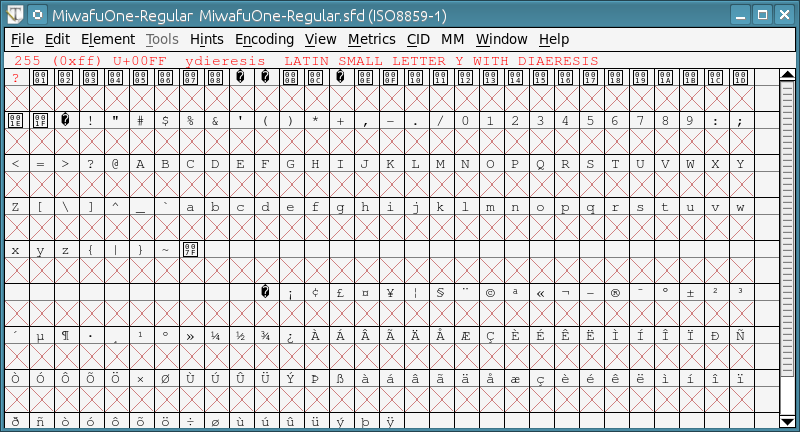
The first thing to do is start up FontForge and create a new font. This will then give a huge list of boxes with Xs in them. Don't panic, those are just empty places for glyphs and correspond to Unicode points.
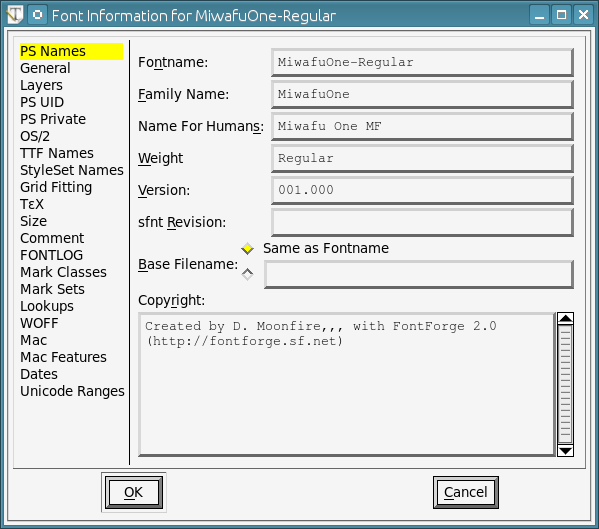
Go into Element / Font Info and populate the first three fields. These can't have any fancy characters (ANSI only) and the top two can't have spaces in the names. I use “MF” for “Moonfire” in all my fonts, mainly because of ego.
Creating the slots
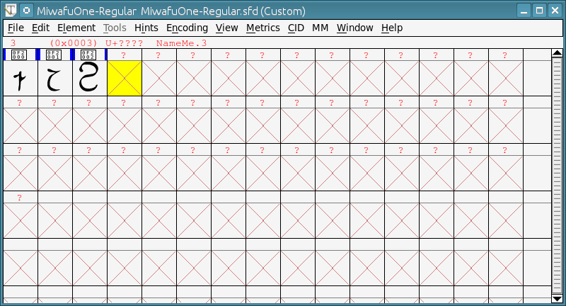
Because I'm not starting with a Latin font, I clear out the entire font first. I select Encoding / Remove Unused Slots which removes all the slots. Then, I select Encoding / Add Encoding Slots and create 46, which is the number of glyphs I want.
I haven't found an easy way of creating and naming a range of fonts easily. So, I go through each one, one glyph at a time.
Populating each slot
Start by naming the slot. This consists of right-clicking the first cell and selecting Glyph Info.... In the dialog, fill in the first two fields.
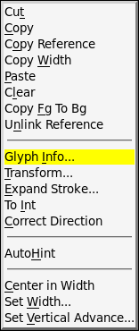
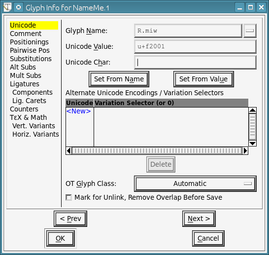
In the first one (Glyph Name), we need an identifier field. I'm using the uppercase letter and “.miw” to indicate this is a Miwāfu glyph. Having “.miw” will make it easier to merge this font later with a more complete one.
In Unicode Value, put the hex value with “U+” in the beginning. If you just put “F2000”, FontForge will crash. But “U+F2000” works just fine.
Click “OK” and go back to the glyph list.
Don't bother saving at this point, FontForge will forget your info until you put an image into the slot.
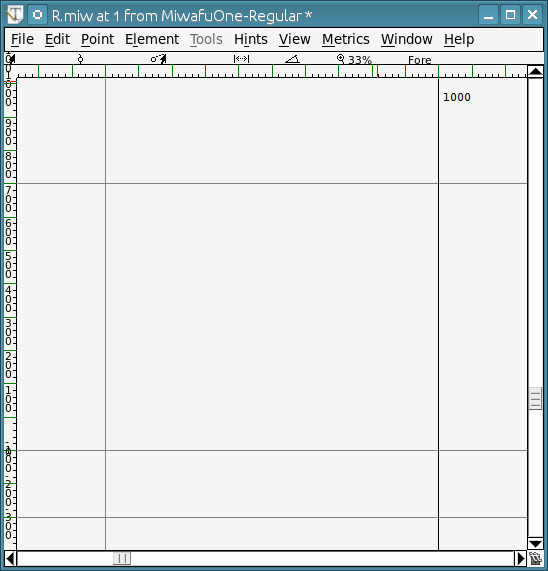
Double-click on the glyph which will bring up an editor.
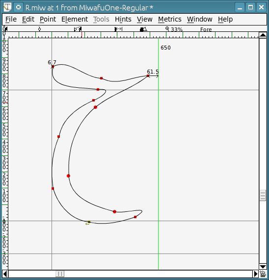
Go into Inkscape, select the first glyph and paste it in. This will probably be not the right size. You can scale it inside the program, but that rarely works for me. Instead, I scale the image in Inkscape until I can just paste the glyph into the editor and move it around.
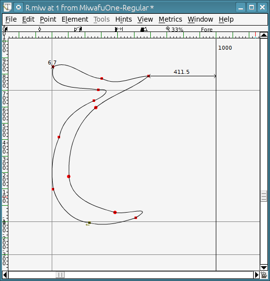
Once I position the glyph, I adjust the right vertical bar to give a small amount of space to the right of the glyph. This is the default spacing between the slots, but it's kind of a art form to find the right spacing (it can also be easily changed later).
Go ahead and close the editor and save. And do it for the next glyph, and the next…
See you in an hour or so. Don't forget to save frequently.
Create the font
Once all the glyphs are put into the font, I can create the font. I like OTF format over TTF, but either works. To generate the fonts, we use File / Generate Fonts.
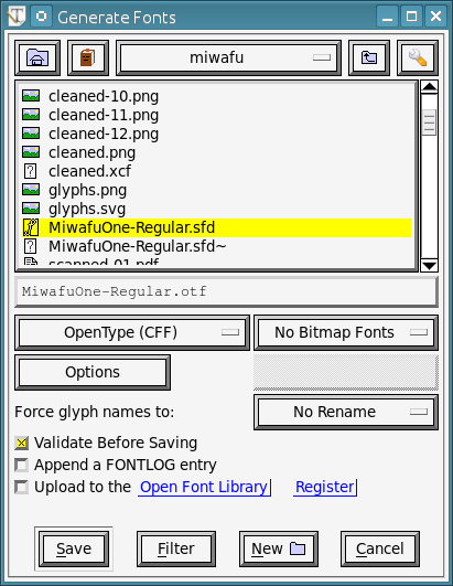
Unless you've done this before, are lucky, or know what you are doing, chances are you'll get an error message like this. I usually do, but most of the time, the problems are fixable. Control-E in the editor is good for finding errors. Moving points around and drawing fixes some of the other problems.
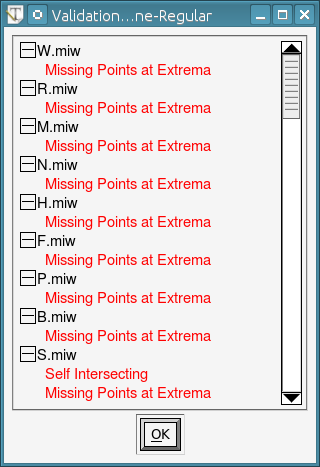
Eventually, you can plug at it and get through all of the errors. Don't skip them, FontForge is telling you for a reason. Once you finish, you'll have an OTF or TTF font wherever you saved it.
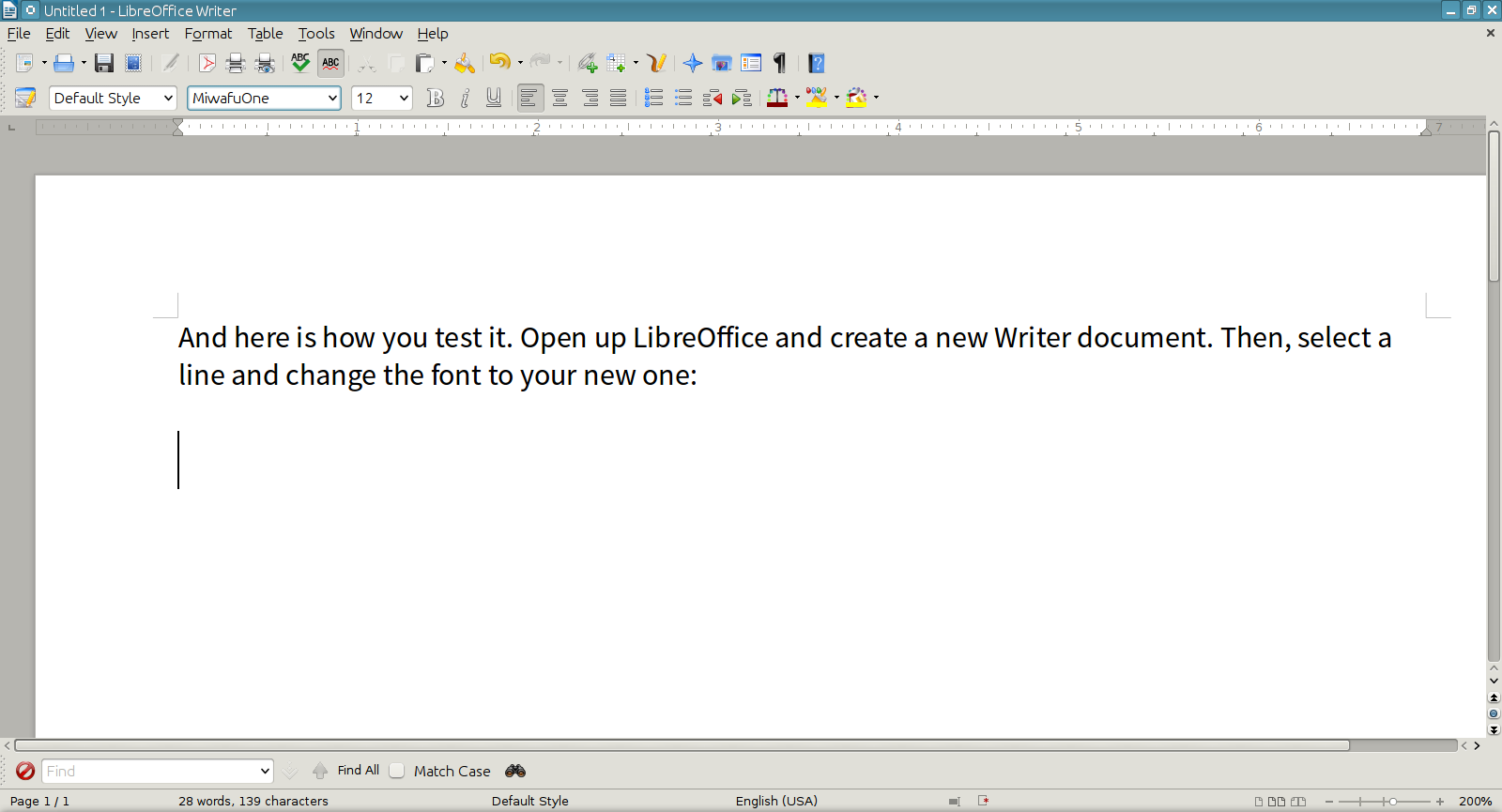
Testing it out
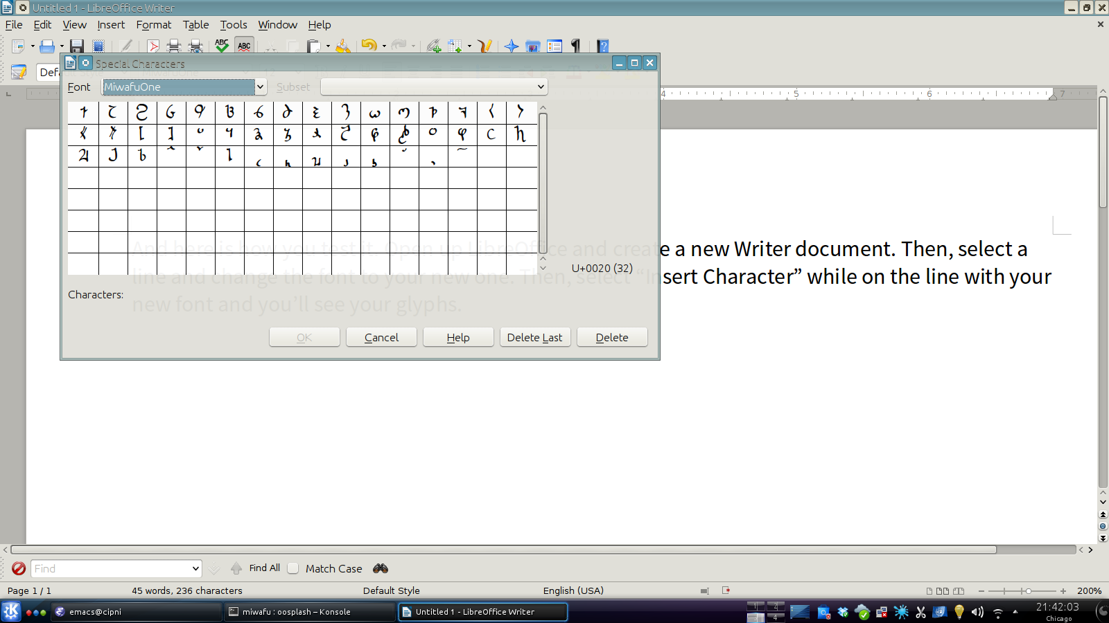
And since we're finally at a point of seeing it in a word processor, we can use LibreOffice after installing the font into your system.
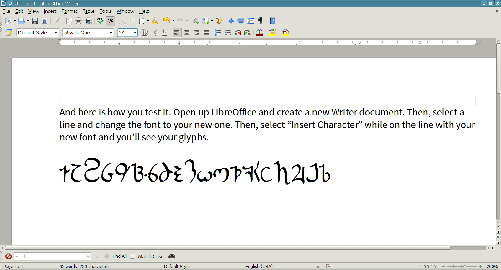
And… after all of these posts, I can finally show a couple names from my novels.

In the future
There is a lot here and things to do. I have a basic font, but the diacritics are not working nor is the accent. The next step will be how to get those working in the font and see if I can get the eastern version rendering properly.
I also have to tweak the kerning and spacing between the characters so it looks a bit more even on screen. For example, “Y” should be a bit further down and nestled underneath the vowel.
Well, this is a point where I need to stop for now. I have to work on Author Intrusion for a little bit.
Metadata
Categories:
Tags: